


Treat it queer branding process
Treat it Queer reached out to me after wishing to rebrand their logo. They had rebranded the brand colours with a previous designer and I was asked to stay within their colour palette.
Check out my process below from sketch to approved graphic.
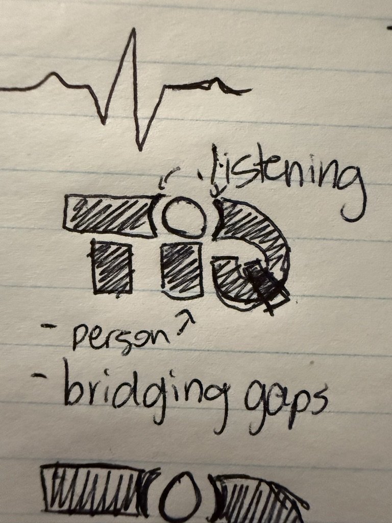

Sketches
I started with a couple of sketches to see the direction TiQ wanted to go with their design. My process for logos and branding consists of asking the client what their values are and how they want to be perceived by potential and existing clients. I ask if they have any imagery they want or what they want to stay away from. From there I create a brainstorming bubble to expand my thinking and to link potential imagery to each value point.
For TiQ it was important that their clients feel heard by them and that clients can trust them to properly bridge the gap to the right health professionals. With that in mind I sent them 4 sketches with my ideas and they chose the top 2 to proceed with.

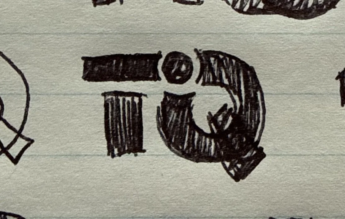
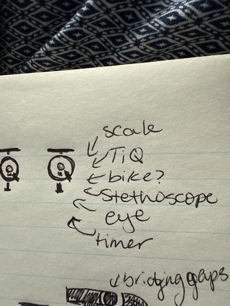
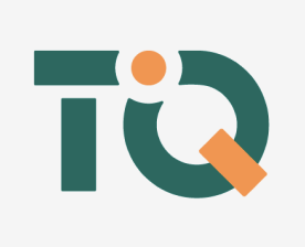

First drafts
Once the original sketches were decided, I started building the logo in Adobe Illustrator. I wanted to keep the person first aspect in the design so I made the “i” stand out from the rest with either colour changes or breaks in the design.
They liked the idea of the break between the Q and “i” but preferred the straight line over the arrow so I created a second draft that more closely aligned with what they wanted.